I was recently chatting with a colleague about what comprises a successful “call to action” (CTA) within a website. A call to action is quite simply a response that you want users to complete. Every website has some objective for its users, such as signing up for a newsletter or filling in a contact form. A call to action provides focus to your website, a way to measure your site’s success and direction to your users. Here, I have outlined 10 techniques for creating an effective CTA within a website, and looked into the psychology and neuroscience behind why they are effective.
- A clear explanation
- The deal sweetener
- Visual Hierarchy
- Action verbs
- Save
- Buy
- Shop
- Call
- Compare
- Register
- Subscribe
- Find
- Order
- Donate
- Correct Position
- Whitespace
- Use Color Effectively
- Bigger is better (within reason)
- CTAs on each page
- Building Trust
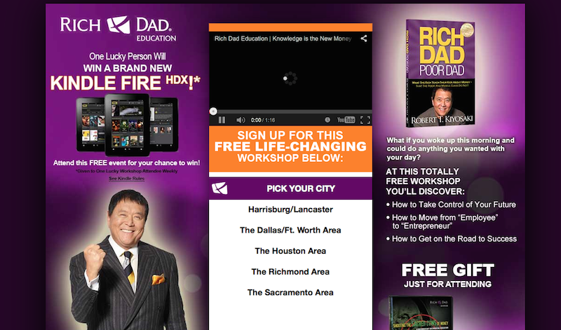
- Rich Dad Education Seminars has a website that is way too busy and the call to action “pick your city” has nothing compelling about it. There are no obvious benefits to clicking the CTA and the whole website looks unprofessional.
Oyster has the download button as a call to action and they have a concise explanation of what the user will get by downloading Oyster: “Oyster is simple the best way to read. Subscribe to Oyster Unlimited and get access to 1 Million books or buy any book in our store.” And the blue “Try Oyster Unlimited For Free” button give users an immediate answer to how much it costs.
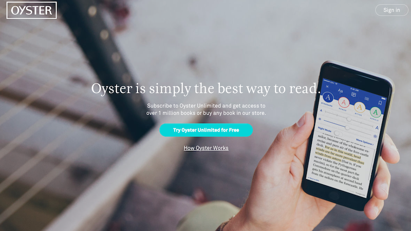
Why it works: As I mentioned in my second blog entry, we are strongly driven to seek out information about our environment. Here, the simple presentation of information makes for a pleasant user experience. Our brains are wired for learning because it makes us feel good. Learning causes an increase in the level of dopamine in the brain (particularly in an area called the ventral tegmental area), causing us to feel pleasure.
Sometimes you have to add value to the CTA, to encourage users to complete this call to action. Incentives could include discounts, entry into a competition or a free gift. The World Wildlife Fund is a good example of a nonprofit that used this effectively on their website, with free gifts like a sweatshirt, with a donation.
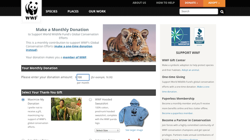
Why it works: In psychology, we talk about the social norm of reciprocity, which is the expectation that people will respond favorably to each other by returning benefits for benefits. In advertising, a small gift of some kind is offered with the expectation of invoking a desire in the recipient to reciprocate in some way, like purchasing a product or making a donation (as seen in the previous example). Evolutionary psychology’s explanation of the norm of reciprocity is that helping others increases the likelihood that they will help us in the future, which has powerful survival value. "I’ll scratch your back if you scratch mine."
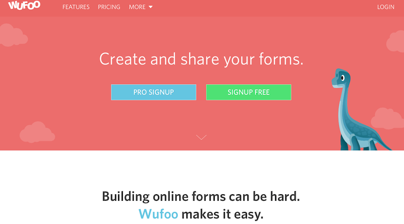
As I’ve discussed in previous blog entries, using too many stimuli is overwhelming and doesn’t allow the user to focus. If you have more than one CTA, the preferred action should be more prominent, using some sort of visual hierarchy (e.g. top to bottom or left to right). Here is an example where they almost got it right: On WUFOO , “Pro sign up” is the preferred CTA, so it is listed on the left of “sign up for free.” The idea of using two CTAs is to convert more visitors so that those who won’t convert at the purchase stage may sign up for the free option. However, in this case, I would experiment with switching the colors so that the first option was bright green, as this draws the eye. For your lesser CTA buttons, try using grayscale buttons or monochromatic colors.
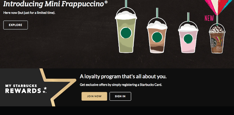
Starbucks does this quite well, as you can see below:
Why it works: The concept of visual hierarchy, notably used within the field of graphic design, is based on Gestalt psychological theory, which states that the brain has a unique way of organizing individual elements of a visual object into a ‘whole’. When an element in the visual field is disconnected from this ‘whole’, it appears to ‘stand out’ to the viewer. The brain disassociates objects from one another based upon certain physical characteristics, which encompass four categories: color, size, alignment, and character. In both the WUFOO and Starbucks example, the web designer was attempting to control visual hierarchy by guiding the eye to from left to right (the principle of alignment) but in the WUFOO example, they messed up by neglecting the influence of color, which made the second CTA stand out.
A call to action should also clearly tell users what to do, using active words like:
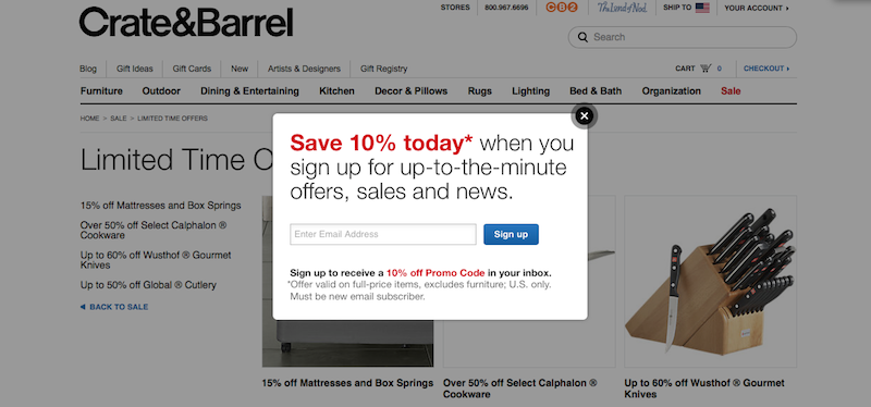
To create a sense of urgency and a need to act now, these words can be used alongside a limited-time offering or a special discount for an immediate purchase. For instance, Crate & Barrel have a popup that offers you “10% off today” and the blue “sign up” button as a CTA.
Why it works: “The perceptual set theory” in psychology addresses how humans consider objects, people and experiences based on combining selective sensory data with the memories of former experiences, to develop an interpretation. When users are on your landing page, they are expecting to see a call to action. I discussed this concept in my first blog entry on attention. This is a perfect example of where attention is guided by top-down, memory-dependent, or anticipatory mechanisms.
As is often the case in neuroscience research, a specific part of the brain, the posterior-lateral-temporal cortex has been identified which appears to process action verbs (relative to other word and nonword types). In some neuroscience studies, this concept was taken further when it was determined that action-related verbs produce sensorimotor neural activity, suggesting an overlap in neural structures associated with linguistic representations of actions and those involved in actual action execution.
The position of your call to action on the page matters. Ideally it should be placed high on the page and in the central column.
PressBooks does this attractively, placing their ‘create your book’ button centrally on the page, above the fold.
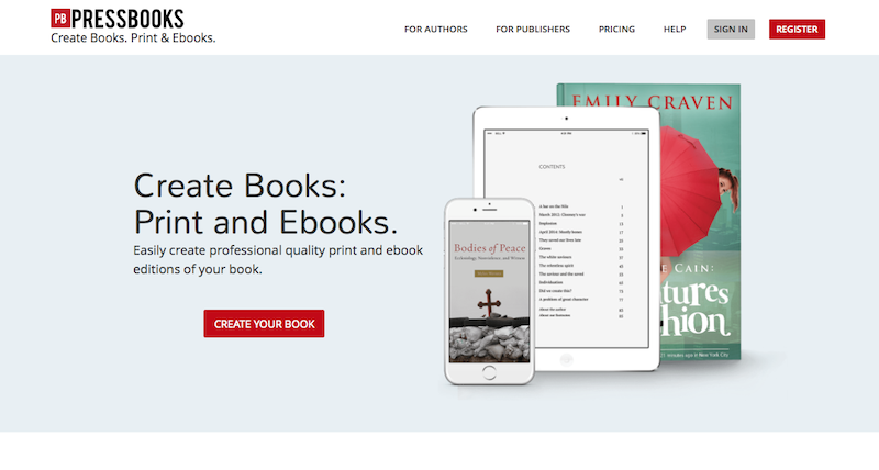
Why it works: Again, we can relate this back to the Gestalt psychological theory. But also, consider the anatomy of the visual system. The foveal system of the human eye is the only part of the retina that allows 100% visual acuity. The fovea is what we use for sharp central vision where visual detail is important, such as reading and driving. As I discussed in my first blog entry on attention, bottom-up attention is driven by salient stimuli, but is memory-free, and reactive. Our senses are bombarded with more stimuli than we can possibly process, therefore you want to make it as easy as possible for users to view your CTAs, by placing them centrally in the visual field, for foveal processing.
The more whitespace around a CTA, the more attention is drawn to it. Clutter up your CTA with surrounding content and it will be lost in the overall noise of the page.
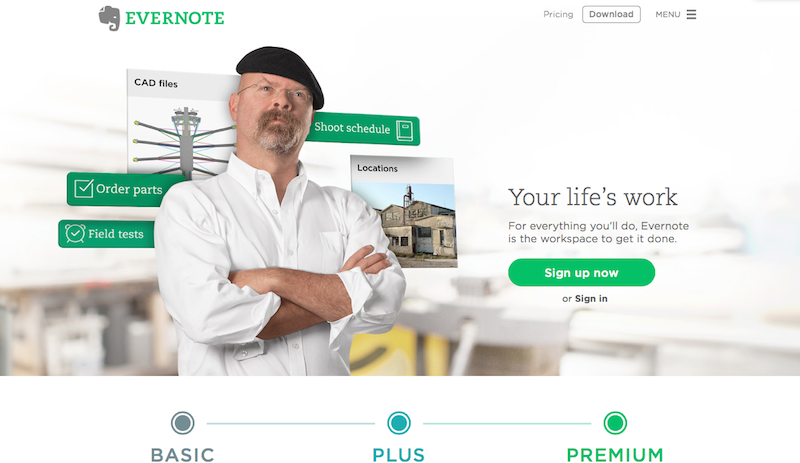
Evernote does an excellent job of focusing users on their CTAs by using a matching green for the CTA button, the Evernote logo and “premium.” These all jump out on the white page, and the background image of the person doesn’t compete with the CTA.
Why it works: Again, we must use the Gestalt psychological theory so that the CTAs stand out from the background of the webpage. According to a Behavior and Information Technology paper , users form an opinion on the visual appeal of a website within 50 milliseconds. As I’ve discussed in my first blog entry, in both bottom-up and top-down processing, attended objects cause an amplified neuronal response in the visual cortex, which in turn leads to better memory storage of the item. Neuronal responses to unattended stimuli are suppressed. Therefore, you must create a CTA that doesn’t have too much competing imagery in the background of the website, so as not to interfere with either the bottom-up and top-down attentional processing.
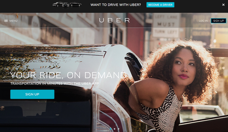
Color was used in the previous example to draw attention to a CTA, which is especially effective if it is in sharp contrast to the background or page as a whole. Look at Uber , which has bright blue “Sign Up” and “Become a Driver” CTAs. This contrast leaves you in no doubt as to the next thing you should do, though I would personally prefer a black and white background, for greater contrast. A good general principle is to use bright colors sparingly for the CTA, or risk overwhelming the user. As an important side note, you should never rely entirely on color for CTAs, because many users are color-blind and will not see the contrast.
Why it works: Color not only draws the eye but is also useful for grouping items together, according to meaning and context. The Gestalt Law of Similarity states that objects that physically resemble each other are seen as part of the same object. It isn’t an accident that Uber has matching blue buttons for “sign up” and “become a driver”. Evernote did this as well, in the example above.
The bigger the call to action, the more it will get noticed. For instance, Mozilla’s Firefox homepage has a download link that completely dominates the page. As long as it doesn't take on cartoonish dimensions, this is a useful technique. Also, remember that with a larger CTA than other elements on the page, there has to be enough whitespace around it.
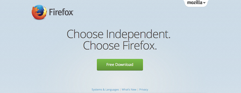
Why it works: In a joint eye tracking studyby IBM and Google, they determined that there were significantly longer fixations for smaller fonts and a reading speed advantage for larger fonts. If users really are forming their judgments of your website within 50 milliseconds, then it makes sense to use larger fonts for your CTAs. You don't want your users to dismiss your website just because the text is too small.
There should be a CTA on every page, not just the home page. These calls to action don’t all have to be the same. For instance, look at Mixbook . They have a different CTA on each page like “start your book”, “start your card”, “download mosaic” and “start yours now.” Each button is optimally positioned.
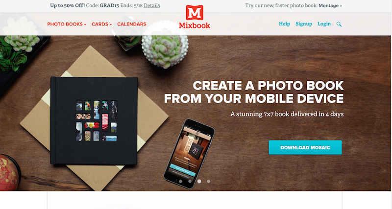
Why it works: By definition, you need a CTA, in order to inform your user what you expect them to do next. This could be everything from downloading a paper, subscribing to your email list, or putting a product into their shopping cart.
Be aware of what happens when a user does respond to your CTA. For instance, if you ask for too much personal data, your users may drop out of the process. Dropbox is a good example of a website that only asks for a minimal amount of information to sign up.
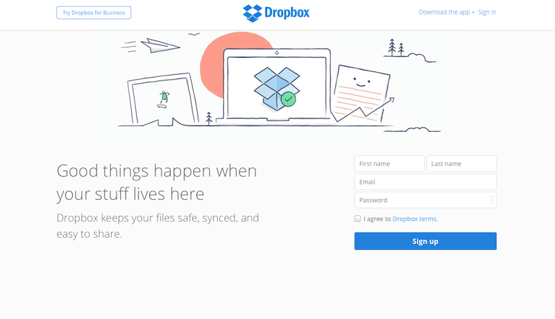
Why it works: Many studies, including the Edelman Trust Barometer (the 13th annual global survey of trust in 26 countries) have found that with greater levels of trust, there are greater levels of customer engagement. If people trust each other conditionally, the brain’s reward center, the VTA (vental tegmental area) activates. But distrust causes activation of the anterior cingulate cortex, an area of the brain associated with decision-making and emotion, which in turn activates the amygdala. You may remember my discussing the amygdala in previous blog entries. This is one of the oldest areas of the brain, often referred to by neuroscientists as the “lizard brain.” The right hemisphere of the amygdala is associated with negative emotion and our most basic processing of fear-inducing stimuli. Fear increasingly activates the amygdala and trust decreases activation. Trust effectively frees up the brain for other activities like planning and decision-making. If your website inspires trust, users will have more brainpower to focus on the content of your site. For more info, refer back to my 8th blog entry on creating trust in your web design.
I couldn’t conclude this blog entry without touching upon a CTA that is a failure:
Conclusion:
A call to action is the most important part of the landing page and is an essential part of a successful website. Many CTAs are badly designed and have uninspired text, but if done right, they can generate a real quantifiable return on investment.